

The support chat is the <tufu-chat> element. Installing it is covered in
Installing on your website; this page is about making it fit your site.
The appearance studio#
Open Bots, pick your bot and choose Appearance. On one side are the settings; on the other, the real chat on a stand-in page, updating as you go. Switch the preview between a desktop and a phone, a visitor in light or dark mode, and a shop, a docs site, a blank page or your own site.
- Match my website: paste your address and tufu reads your colors and logo and suggests a look you can apply in one click.
- Color: pick one brand color. tufu builds the rest for light and dark pages and checks that every pair of text and background is readable (WCAG AA). If one isn't, it offers the nearest readable color. Advanced colors lets you set each one by hand. Theme keeps the chat light or dark, or follows each visitor.
- Chat button: a pill with a label, a round bubble, or a tab on the edge of the page; the icon (or your logo); the label; the side; how far from the corner.
- Chat window: the name in the header, the avatar (Tuf, one of Tuf's flavors, your logo, or none), the corners and the font. Fonts are ones your visitors' devices already have, so nothing extra downloads on your site.
- First message: the greeting, and up to four suggested questions a visitor can tap to ask.
- Branding: on the Team plan you can hide "Powered by tufu".
Save, and visitors see the new look within about five minutes. There's nothing to change on your site.
What visitors see#
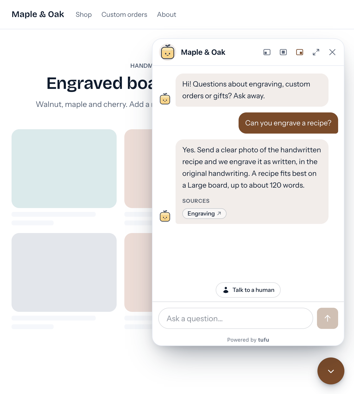
A "Chat with us" button in the corner of the page. It opens the chat in a panel above it, or a full-screen sheet on phones, with your bot's name at the top. Visitors can dock the panel left, right or center and make it bigger. Esc or the close button closes it, and the conversation stays put while they browse. The chat follows the visitor's light or dark preference.
Inside, the bot answers with links to the pages it used, and Talk to a human hands the conversation to your team: you get pinged, and your reply shows up right there in their chat.
Options#
| Attribute | Default | What it does |
|---|---|---|
team |
(required) | Your team ID. |
bot |
(required) | The bot's handle. |
button-text |
the label set in tufu | The label next to the chat icon. button-text="" gives a round, icon-only button. |
position |
the side set in tufu | Where the button sits and the chat opens on larger screens: right, left or center. |
expanded |
not set | Add it to open the chat in its bigger size. |
visible |
not set | Add it to open the chat when the page loads. |
An attribute on the element wins over the same setting in the studio. Older snippets include
button-text="Chat with us": remove it to use the label from the studio.
From JavaScript: document.querySelector('tufu-chat').show() and .hide().
<tufu-chat team="your-team" bot="your-bot" button-text="Questions?" position="left"></tufu-chat>Styling it with CSS#
The studio covers most needs. For more, the button lives in a shadow root, so you style it with CSS variables on the
tufu-chat element; your values win over the studio's. This example changes the colors and places the button
inline, where the element is, instead of floating in the corner:
<style>
  tufu-chat {
    /* The default is position: fixed; right: 20px; bottom: 20px; */
    position: static;

    /* The button (defaults: tufu ink, flipped for dark mode) */
    --button-background-color: #1d4ed8;
    --button-background-color-hover: #1e3a8a;
    --button-text-color: #ffffff;
    --button-text-color-hover: #ffffff;
    --button-border-color: transparent;
    --button-border-color-hover: transparent;

    /* The open chat's header and footer */
    --tufu-panel-background: #ffffff;
    --tufu-panel-text-color: #0f1b2d;
    --tufu-panel-border-color: #e4e9f2;
  }
</style>
<tufu-chat team="your-team" bot="your-bot" button-text="Questions?"></tufu-chat>
Showing above other elements#
If the chat appears below something else on your page, raise its z-index with --tufu-z-index (the default is
50):
<style>
  tufu-chat {
    --tufu-z-index: 1000;
  }
</style>